How to visualize tabular data when using krangl?
There are multiple visualization engines that are compatible with krangl.
lets-plot
lets-plot is an open-source plotting library for statistical data which is written entirely in the Kotlin programming language.
For new users of krangl, we strongly recommend to use lets-plot because of its stability and ease of use.
For a fully worked out tutorial see the jupyter workbook sleep_patterns.ipynb.
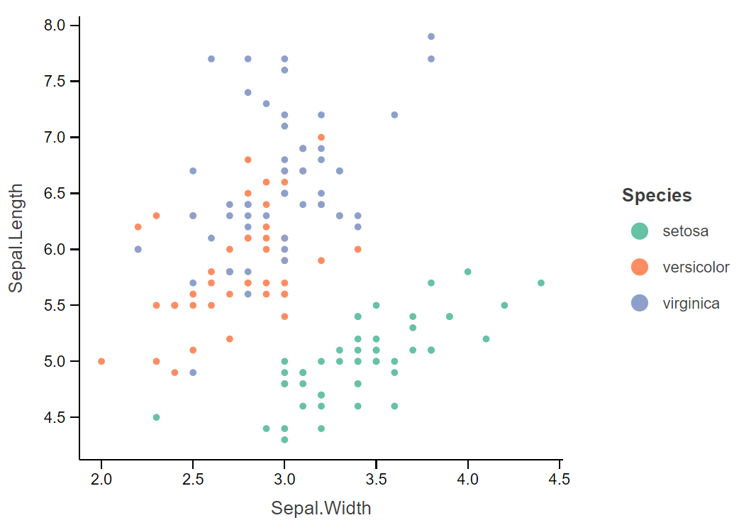
Example
import jetbrains.letsPlot.*

irisData.letsPlot{ x= "Sepal.Width"; y="Sepal.Length"; color="Species"}
    + geomPoint()
kravis
kravis Implements a grammar to create a wide range of plots using a standardized set of verbs.
kravis essentially wrap ggplot2 from R. The latter it will access via different backends like a local installation, docker or Rserve. It is more versatile compared to lets-plots because it supports to full ggplot2 grammar, but relies on R as non-java binary as dependency.
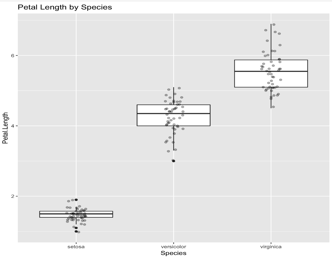
Example
import kravis.*
import krangl.irisData

irisData.ggplot("Species" to x, "Petal.Length" to y)
    .geomBoxplot()
    .geomPoint(position = PositionJitter(width = 0.1), alpha = 0.3)
    .title("Petal Length by Species")
Other options
There are great other libaries available, which typically don't work with krangl yet, but provide awesome ways to visualize data. See here for a listing.